Last updated on
The color scheme of our homes is more than just a pretty palette. It has the potential to change the atmosphere of individual rooms, and the mood of the house as a whole.
Whether traditional or modern, bold or subdued, there are 6 simple rules to guide your color choices when painting your custom home interior.
What's Inside
1. Begin With the Bold
Unless you’re building a custom home from scratch, more often than not a color palette will be influenced by some of the existing elements of your home aesthetic. Furniture, furnishings and fittings can all offer starting points for your palette. A patterned rug, or an abstract artwork, could introduce a single hue which you want to emphasize throughout the space. Alternatively, warm metal accents or timber flooring may guide you toward a warmer color palette.
If there’s a clear dominant color, such as a loud red rug, don’t try to compete with it. Create mood boards, collect magazine clippings and research online as to what colors will complement your main tone. If you’re stuck for a starting point, look towards seasonal colors, or on-trend Pantone hues.
2. Go From the Ground Up
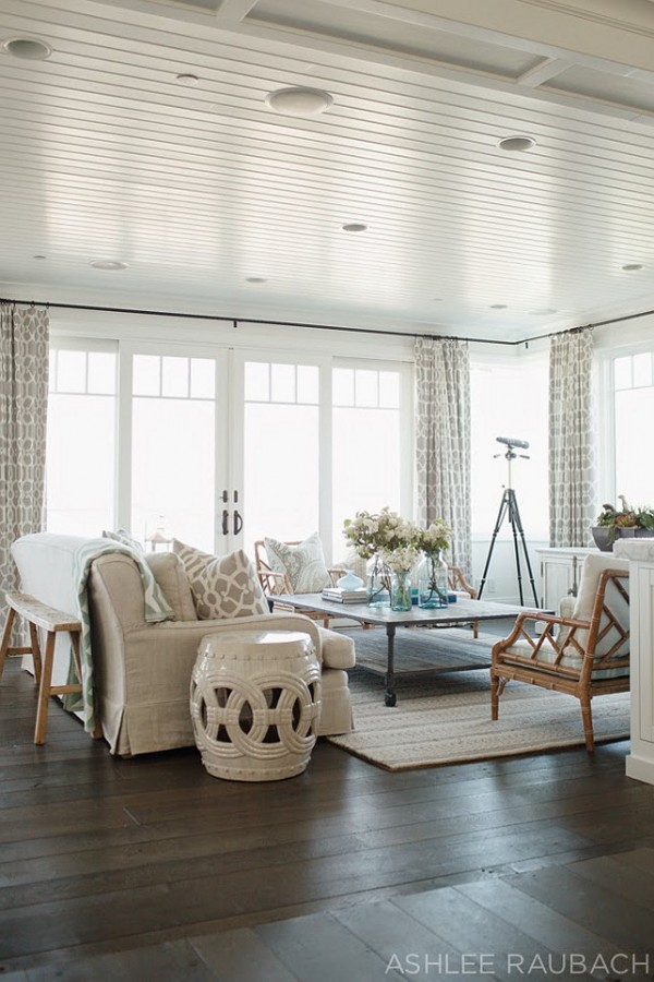
We expect to find darker colors at ground level, with tone naturally tinting as they eye travels upwards. It’s thought to mimic our natural surroundings, where we find dark earth beneath our feet and pale skies above our heads. While dark floors are far from a necessity, it’s a good idea to stay away from black ceilings, or dark walls which contrast very pale flooring. When in doubt, stick to neutral flooring and walls, while dressing up rooms with brighter furniture and decor.
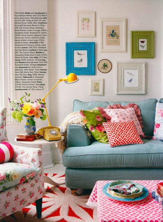
3. Stick to the Golden Color Ratio
A three-toned color scheme should be divided into 60-30-10 ratios, designers unanimously agree. That means that the main color should take up approximately 60% of the space. Commonly, this is a less-dominant pale shade reserved for the walls. 30% is reserved for your pop of color, like a rich burgundy or leafy green, for example. Couches, bed linen and soft furnishings can all pick up this trend to carry it throughout the space. Finally, a 10% finishing touch may come in the form of a material, such as copper or marble, or even a piercing lime green. Too much of this may be overwhelming, whereas a slight accent can create the perfect finish.
4. Take Cues From Color Harmony Theory
Put simply, color harmony theory underpins what the human eye deems as colors which go well together. Most of us last heard about the color wheel in our high school art classes, but this simple device can offer plenty of insight into selecting colors for your home interior. The wheel can be used in a number of ways, depending on how in-depth you want to go. Put simply, contrasting colors are those which are opposite each other on the wheel, such as red and yellow. Analogous colors are those which appear next to each other, such as red and orange. For those who aren’t quite ready to go quite so bold, there are monochromatic and even achromatic palettes to consider.
5. Think About Connecting Spaces
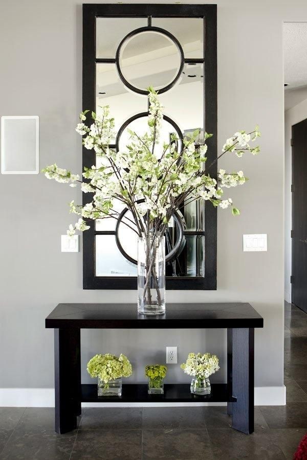
A room may look stunning on its own, but it’s easy to forget that these rooms are part of the wider house theme. When we experience an interior space, it’s not in isolation. We move between rooms, taking in each area until we come to rest at an overall impression. Whether that impression is with visitors, owners or buyers to be, it’s crucial to remember the broader context of your color scheme.
Connecting spaces, such as entryways, hallways and stairwells, are best kept neutral. These closed-in spaces can risk feeling oppressive if dark or bold colors are used poorly. Greys, beiges and creams go well in these spaces and give visitors and dwellers alike some visual rest between more vibrant areas. After all, these spaces are often not focal points in themselves, but links between more dominant rooms. Add interest and personality with art and decor.
6. Try Before You Buy (in Bulk)
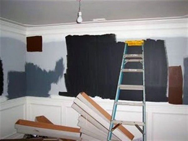
Color swatches are rarely an exact indicator, as we tend to interpret color differently on a larger scale. Before you go all out at the paint store, purchase test pots of your chosen palette and get to work painting a swatch on your walls. You may find that you need to adjust the shades and tints at this crucial stage to get the perfect combination.
Read More
 15 Kitchen Garden Ideas for a Fresh and Fun Home Cooking Experience
 Kitchen Table Poly: Understanding Non-Hierarchical Relationships
 What Color Paint Goes with Brown Granite: Matching Tips for Your Home Décor
 Watch Cutthroat Kitchen Online Free: A Basic Guide to Free Streaming Platforms
 8×12 Prints Size: Understanding and Utilizing in Interior Design