Last updated on
Exploring the color palette because understanding the forecasted trends for kitchen cabinet colors in 2024 can refresh your kitchen’s aesthetic and add value to your home.
Key takeaways:
- Green hues: From soft sage to deep forest, green is a popular choice for kitchen cabinets in 2024.
- Pretty plums: Rich, sumptuous plum tones add sophistication and charm to kitchens.
- Buttery yellows and pale peaches: These warm colors create a cheerful and inviting atmosphere.
- Earthy tones: Soft taupes, rich clays, and muted olives bring a sense of calm and grounding to the kitchen.
- Dark, rich shades: Deep blues, charcoals, and emerald greens add elegance and depth to kitchens.
What's Inside
Understanding Kitchen Cabinet Color Trends
Navigating the evolving world of kitchen cabinet color trends requires understanding the influences that drive them. These trends often reflect broader design movements and homeowner preferences.
For instance, the popularity of certain colors can mirror societal shifts toward sustainability or the collective mood, with calming tones becoming favored during times of stress. Technological advancements in materials and paint also play a role, sometimes making previously impractical colors more durable and easier to maintain.
Additionally, the psychological impact of color on mood and space perception is a key factor; lighter colors can make a kitchen feel more spacious, while darker hues bring a touch of sophistication. Trends also intersect with functionality, as some colors may hide wear and tear better than others, an important consideration for one of the most used spaces in a home.
Keeping these concepts in mind will help when delving into specific color choices for kitchen cabinets in the upcoming year.
Green, Green, and More Green
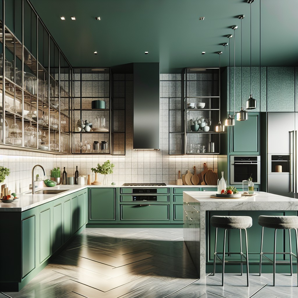
In 2024, the affinity for natural elements continues to influence kitchen design. Various shades of this verdant hue, from soft sage to deep forest, bring the calming essence of the outdoors into the heart of the home. Opting for lighter greens can brighten and refresh the space, lending an airy, optimistic vibe, whereas darker shades create a sense of sophistication and depth.
As sustainability grows in importance, this color also underscores an eco-friendly aesthetic that resonates with many homeowners. It pairs beautifully with natural wood finishes, as well as both warm and cool metal fixtures, proving its versatility across a range of kitchen styles.
Pretty Plums
Elevating your kitchen space with a touch of sophistication is seamless with plum’s rich, sumptuous tones. This versatile color works well with different materials and finishes, adding a modern yet timeless charm.
When paired with brushed gold hardware or light countertops, it creates an air of luxury. For a more cohesive look, consider incorporating draperies or kitchen accessories in complementary shades, such as muted lavenders or soft pinks. These hues not only add depth but also help in crafting a unique culinary oasis that stands out for its warmth and welcoming vibe.
As a color that can adapt to both contemporary and traditional designs, it provides an excellent backdrop for creativity and personal expression in your kitchen.
Buttery Yellows and Pale Peaches
Embracing the warmth of the sun and the softness of early dawn, hues such as creamy yellows and subtle peaches offer a cheerful and inviting atmosphere. These shades reflect natural light beautifully, making the space feel larger and more welcoming.
- These colors work exceptionally well with a variety of materials, balancing nicely with natural wood accents or countertops in warm marble tones.
- Consider pale peach for a softer, more romantic aesthetic or opt for a buttery yellow for a brighter, energizing effect.
- They pair well with both contemporary and traditional designs, ensuring longevity in visual appeal despite changing trends.
- Maintenance-wise, these lighter colors are forgiving with smudges and stains, keeping your kitchen looking pristine with less effort.
- For a harmonious color scheme, complement these warm cabinet shades with cooler accents like blues or greens, or create a monochromatic palette with varying shades of yellows and oranges.
Earthy Tones
Embracing nature’s palette in your kitchen infuses the space with a sense of calm and grounding. Think of the hues that embody the great outdoors—soft taupes, rich clays, and muted olives. These tones work harmoniously together, creating a backdrop that complements both rustic and modern aesthetics.
The beauty lies in their versatility; pair them with natural wood elements for a cozy, cabin-like feel, or contrast with bright white accents for a fresh, contemporary vibe. Opt for a matte finish on cabinets to enhance the earthy, organic ambiance. Remember, the key is to evoke the tranquility of nature, making your kitchen a serene retreat in your home.
Dark, Rich Shades
Embarking on a journey through the color spectrum brings us to a luxurious halt at deep, velvety hues. They add a touch of elegance and gravitas to kitchens. When you drape your cabinets in these shades, they become the focal point, exuding a confident presence. These colors, typically ranging from sumptuous blues to resolute charcoals, work wonders in both spacious and cozy settings, creating a perception of depth that can make your space feel more expansive.
Pairing these darker tones with contrasting light countertops or backsplash can create a sophisticated balance. For those wary of a somber effect, incorporating strategic lighting can highlight the richness of these colors, ensuring that the space doesn’t lose its inviting warmth. It’s a bold move that pays off by making the heart of your home not only functional but also remarkably stylish. Consider hues like midnight blue, espresso, or emerald green to give your kitchen an air of modern luxury while keeping it welcoming and chic.
Serene Neutrals
Neutrals have the unique ability to tie different elements of a kitchen together, creating a cohesive and calming atmosphere. This palette includes soft grays, warm beiges, and light taupe.
These shades provide a versatile backdrop for decor, allowing you to easily switch up accent colors or patterns without having to redo your cabinetry.
They reflect light beautifully, making a kitchen feel more spacious and open—a perfect trick for smaller kitchens.
Neutral-colored cabinets can help increase the resale value of your home, as they appeal to a wide range of personal styles and prevent potential buyers from being put off by more specific color choices.
For added depth and texture in a neutral kitchen, consider using various finishes or mixing materials like wood with matte or glossy finishes.
Bold and Vibrant Hues
Daring homeowners seeking to infuse energy into their kitchen spaces are increasingly gravitating towards striking colors that pack a punch. These hues are not just conversation starters but also serve as the heart of the home’s design aesthetic.
For those willing to make a splash, here are a few key considerations:
- Impact vs. Longevity: Vibrant cabinets create a focal point, but consider potential color fatigue. Will you love it in five years?
- Balance with Neutrals: To avoid visual overload, pair vivid cabinets with subdued walls and countertops.
- Lighting Matters: Natural and artificial lighting can significantly affect the appearance of bright colors. Test samples at different times of the day.
- Complementary Colors: Use the color wheel to find hues that accentuate your bold choice without clashing.
- Finish the Look: Matte or high gloss? Each finish reflects light differently, impacting the overall feel.
When executed thoughtfully, kitchens with bold cabinetry become dynamic spaces full of personality and style.
Unique Color Combinations
Daring to pair unconventional hues can transform your kitchen from a purely functional space to a designer’s canvas. Consider a duo like sage green with apricot accents for a harmonious yet unexpected palette that soothes and energizes simultaneously.
Alternatively, charcoal gray coupled with a vibrant teal can create a modern, chic look that’s as striking as it is elegant.
For a subtle twist, mix pastels with muted tones. A soft lavender with a dove gray can give a gentle, romantic ambiance, while still leaving room for versatility in decor choices.
Remember, the key is balance—choose one dominant color and use the second as an accent to avoid overwhelming the senses.
Creative color pairings not only imbue your kitchen with personality but also have the potential to influence your mood and the room’s perceived temperature. A sunset-inspired combination, with hues of deep orange and rich reds, can evoke warmth and comfort. Whereas a blend of cool blues and crisp whites might elicit feelings of freshness and cleanliness.
When experimenting with unique combinations, it’s advisable to test samples in your actual kitchen environment, considering how natural and artificial light play with the colors at different times of the day. This ensures that the chosen scheme delivers the desired effect and truly complements your space.
Metallic Accents
Metallic accents infuse a touch of brilliance and sophistication into kitchen cabinetry, elevating the space. When incorporating metallics, consider the following points to ensure a balanced and stylish look:
- Hardware choices: Opt for knobs, pulls, and hinges in brushed nickel, rose gold, or matte black to make a chic and modern statement.
- Balance and contrast: Pair metallic accents with matte finishes on cabinets to create a harmonious contrast that catches the eye without overwhelming.
- Reflective surfaces: Use these accents sparingly to reflect light and add depth, making your kitchen appear larger and more open.
- Tying in appliances: Coordinate with stainless steel or panel-ready appliances for a cohesive, designer touch.
- Longevity: Choose timeless metallic tones that will stand the test of time in terms of style and durability.
Remember, the key to using metallics is moderation; a little shimmer goes a long way in enhancing the aesthetic of your kitchen cabinets.
Retro and Vintage Colors
Taking a cue from the past, retro and vintage hues are making a robust comeback, offering a fun and nostalgic twist to modern kitchens. Think of the charming pastels commonly found in 50s diners or the vibrant colors that were all the rage in the 70s.
- Mint greens and soft pinks channel a 50s vibe and pair wonderfully with creamy whites or light wood finishes.
- Mustard yellows and olive greens reflect the earthy tones of the 70s, delivering a warm and welcoming atmosphere.
- For a bolder statement, turquoise or cherry red can evoke a sense of the 60s and add a dynamic pop of color to your space.
- To bridge the gap between old and new, incorporate vintage-inspired appliances or accessories that complement these cabinet colors.
By integrating these classic colors, your kitchen can achieve a timeless quality with a nod to vintage aesthetics, all while maintaining a fresh and contemporary feel.
Customization and Personalization
In the realm of kitchen cabinetry, celebrating individuality has become a hallmark of design. With custom color options, homeowners can infuse their personal touch into the heart of their home.
Here are some key points that encapsulate the rise of customization in kitchen aesthetics:
- Bespoke Hues: Manufacturers now often offer custom color-matching services, allowing customers to bring their unique vision to life, creating a space that’s truly one-of-a-kind.
- DIY Paint Solutions: For the hands-on individual, paintable cabinet fronts provide a canvas for creativity. A fresh coat of paint can transform the kitchen, mirroring one’s changing style over time.
- Mix and Match: Combining different colors and finishes for upper and lower cabinets or contrast islands not only adds visual interest but also reflects a playful yet harmonized approach to personal style.
- Texture Talks: Beyond color, integrating textured finishes like matte, glossy, or wood grain effects adds another layer of personalization, allowing for a rich, tactile experience.
- Hardware as Jewelry: Cabinet hardware can act as the perfect accessory to tailor a kitchen’s look, with options ranging from vintage knobs to modern pulls serving as the finishing touches that fully express personal style.
Warm Sand
Imagine stepping into your kitchen and being enveloped in the calmness of a tranquil beach. This is the essence of choosing a warm sand hue for your cabinets. It’s a color that echoes serenity and simplicity, transforming your cooking space into a soothing sanctuary—a place where you can unwind as you prepare your meals.
This shade pairs beautifully with a variety of accent colors, from ocean-inspired blues to lush greens, allowing for a versatile color scheme that can be tropical or muted, depending on your preference. It also serves as an excellent backdrop for texture play, so consider incorporating materials like wicker or bamboo for that subtle tactile interest.
In terms of maintenance, lighter shades like warm sand may show dirt more easily than darker tones, but they are far more forgiving than pure white. This makes them ideal for busy households looking for a balance between functionality and style.
Furthermore, this color works well with natural light, reflecting it and creating the illusion of more space which is particularly beneficial for smaller kitchens. It’s a modern take on neutral that’s both fresh and timeless, ensuring that your kitchen remains stylish and inviting for years to come.
Deep Sea Blue
This shade of blue evokes a feeling of depth and sophistication, seamlessly blending with a variety of kitchen styles. It works exceptionally well with brass or gold hardware, creating a luxurious contrast that’s both modern and timeless.
Pairing with lighter countertops can brighten the space, while darker ones will create a more intimate atmosphere. It’s a versatile choice that suits well-lit spaces and can even make smaller kitchens appear larger.
When applied to lower cabinets, it anchors the space, and if extended to a feature wall with open shelving, it brings a cohesive and stylish look that stands the test of time.
Designer-Tested Color Schemes
When selecting a scheme, it’s wise to consider the overall ambiance you aim to create. Professionals often agree on a few guiding principles:
1. Balance and Contrast: A designer-approved approach combines light and dark hues to achieve a balanced look. For instance, pair soft beige cabinets with a bold navy island.
2. Complementary Colors: Choose cabinet colors that complement the tones in your countertops and backsplash. A terra-cotta cabinet color can harmoniously accentuate blue-tiled backsplashes.
3. Monochromatic Palette: For a cohesive look, opt for varying shades of a single color. Shades of gray, from dove to charcoal, can add depth while maintaining uniformity.
4. Mood Setting: Colors influence mood. Deep greens create a soothing, nature-inspired space, whereas warm reds can energize the kitchen.
Remember, these schemes should serve as a foundation to personalize your kitchen’s palette, reflecting your unique taste and the home’s character.
FAQ
What is the most popular cabinet color for 2024?
The most popular cabinet colors for 2024 are black, green, gray, and blue.
What is the color trend for 2024?
The color trend for 2024 heralds the appeal of various shades of blue, as identified by major paint brands such as Benjamin Moore, Sherwin-Williams, and Valspar.
Are white kitchens out for 2024?
Predictions for 2024 show a decreasing trend for stark white kitchens as tastes shift towards warm neutrals, lighter woods and earth tones.
Are wood cabinets in for 2024?
Indeed, wood cabinets continue to be a popular choice for kitchens in 2024, thanks to their versatility in matching any color and their ability to enhance the spaciousness and elegance of the kitchen.
What are the leading shades for countertops complementing kitchen cabinet colors in 2024?
The leading countertop shades for complementing kitchen cabinet colors in 2024 are misty Carrara, Calacatta gold, and galaxy black.
How can kitchen hardware color choices enhance the overall design in 2024?
In 2024, kitchen hardware color choices can enhance the overall design by offering visual contrast, establishing cohesive themes, and highlighting design details.
Are dual-tone kitchen cabinets a popular choice for the 2024 trend?
Yes, dual-tone kitchen cabinets are a trending choice in 2024 kitchen designs.