Last updated on
Discover how to accent white kitchen cabinets with popular paint colors that will transform your cooking space into a stylish and inviting area.
Key takeaways:
- Undertones of white cabinets guide wall paint choice.
- Consider natural light direction and adjust paint accordingly.
- Warm grays and greiges create cozy and inviting atmosphere.
- Cool-toned grays offer a crisp and spacious look.
- Test real paint samples to see how lighting affects colors.
What's Inside
Determine The Undertone of Your White Cabinets
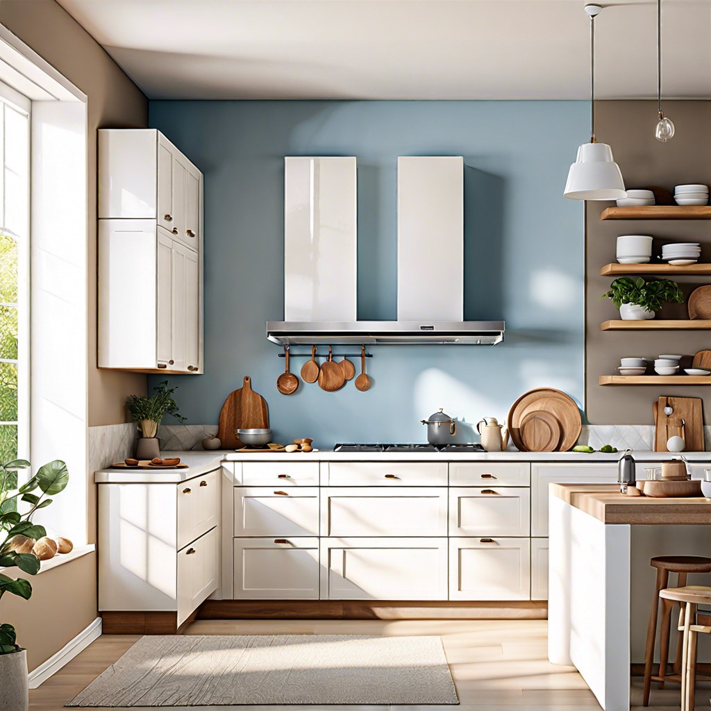
Your white cabinets might seem neutral, but they carry subtle hints of color that can influence your choice of wall paint. Whites can lean towards cool blues, warm yellows, or even have a touch of green. Spotting these undertones is key for a harmonious kitchen palette.
To identify these sneaky hues, place various white samples next to your cabinets in different lighting throughout the day. Sunlight can play tricks, making the color undertones play hide and seek. Trust your eyes – if the cabinets look slightly creamy, there’s a warm undertone lurking. If they seem crisp like a winter morning, that’s a cool undertone waving hello.
Have a stainless-steel fridge or a marble countertop? Hold samples against these too; they’re great at bringing out the underlying colors. Remember, the undertone that surfaces will guide you to paint colors that compliment, not clash.
Consider the Direction the Windows Face and the Amount of Natural Light
Light plays a sneaky yet pivotal role in how paint color transforms throughout the day. North-facing kitchens can present a cooler, shadowier light, often calling for a warmer hue on the walls to balance the chill. A dollop of creamy yellow or a buttery beige can add a touch of sunshine, making the room more inviting.
On the flip side, a kitchen drenched in southern or western sunlight has its own challenge. Such spaces get abundant warm light, which may amplify yellows or oranges, potentially overwhelming white cabinets. To keep things fresh, consider a serene pale blue or a soft mint green, which provide a crisp contrast without turning up the temperature.
But what if your windows are east or west-facing? Here’s a nifty trick: bask in the best of both worlds with an adaptable shade, like a sophisticated greige, that plays well with shifting light – warm and welcoming at sunrise, calm and collected at sunset.
Remember, angles and intensity of light will vary. Trust your gut but also test, test, and test again. Slap on those samples and observe them at different times; frolic in the fleeting morning glow, mull it over during the midday sun, and unwind beneath the dusky evening light. This due diligence is your ally in making an enlightened choice.
Warm Gray and Greige
Warm grays and greiges are the middle ground on the color spectrum, striking a balance that feels cozy and inviting. Picture this: a steaming mug of earl gray on a drizzly Sunday, the comforting hue envelopes your kitchen in gentle warmth while complementing spotless white cabinets. These shades are the chameleons of paint colors, adapting subtly with changing daylight from dawn to dusk and bringing a sophisticated neutrality to your space.
When considering warm grays, remember the color’s ability to soften the starkness of white and create a harmonious backdrop for your culinary adventures. Imagine biscuits baking in the oven, the golden-brown tones reflecting off the walls, creating a sense of welcome and comfort.
Greige, a blend of gray and beige, offers versatility; it plays well with a plethora of accent colors and decor styles, from farmhouse chic to modern minimalist. It’s like finding the perfect pair of denim jeans — reliably flattering, adaptable, and never going out of style. Not to mention, greige works wonders in unifying mixed finishes, making it a practical choice for a cohesive kitchen look that’s as timeless as it is trendy.
Cherry-pick a warm gray or greige and watch as it effortlessly harmonizes with natural elements such as wooden floors or stone countertops, enhancing the texture and depth of these materials. It’s like a cozy hug for your kitchen. Keep in mind, light plays a crucial role, so watch these shades transform with the ebb and flow of the sun’s caress throughout the day, ensuring your kitchen vibes with the natural rhythms of life.
Cool Toned Grays
Pairing cool-toned grays with white cabinets offers a crisp, sophisticated look that can make your kitchen feel more spacious. These shades have blue or green undertones, bringing a soothing and serene vibe to your culinary space. In a room that receives an abundance of daylight, these tones can balance the brightness without creating a sterile environment.
For a harmonious blend, think about a slate gray which subtly contrasts with white, accentuating the cabinetry without overwhelming the senses. Another popular choice is a soft dove gray, perfect for creating a tranquil backdrop that allows for colorful kitchen accessories to pop.
Keep in mind, a high contrast isn’t the goal here; it’s about creating a gentle transition from your cool gray walls to your pristine white cabinets. Grays with just a whisper of color inject a contemporary flair and can serve as an excellent canvas for metallic accents, like stainless steel appliances, to shine.
When selecting your shade, pay attention to your countertop and flooring hues to make sure your gray complements them. Cooler grays usually mesh well with marble or granite that contains veins of cooler colors. Remember, balance is key, and a harmonious kitchen is like a well-conducted symphony – every element should be in tune with the others.
Don’t Forget To Always Use Real Paint Samples!
Snagging a hefty stack of paint chips from the local hardware store sounds like a great start, but let’s take it a step further. Go for sample pots – those little cans are golden. Brush them on your walls and live with them for a bit. Watch how the light plays with them from sunrise to sunset. That color that charmed you in the store might turn into a chameleon in your kitchen.
Remember, natural and artificial lights are the ultimate mood setters. So, they will flirt differently with the colors at various times of the day. You might get a tranquil vibe with your morning coffee only to find a wild party atmosphere when the sun goes down. It’s a bit like speed dating with paint – you’ve got to spend some quality time before you commit.
This hands-on approach beats just dreaming over digital swatches or glossy prints. Those tactile, real-world dabs of color will save you from buyer’s remorse. After all, it’s the difference between what you see online and what you get on your actual walls. No one wants a surprise relationship with their kitchen walls – it’s a long-term commitment, not a weekend fling.