Last updated on
Dwelling into the world of white paint may seem simple until you’re stuck choosing between Benjamin Moore’s Simply White and Chantilly Lace because each offers unique undertones, appearance changes under different lighting, and suitability that could make or break your interior design vibe.
Deciding between Simply White and Chantilly Lace for your walls is like choosing between a warm hug and the crispness of fresh linen; both are white paints, yet they cast distinctly different spells on your space.
As you navigate this choice, understanding the nuances of each option is vital—from the slightly warmer undertones that make Simply White a cozy companion for most settings, to the balanced, neutral canvas that Chantilly Lace provides, brilliantly reflecting light in any room.
Dive deep into the details of Light Reflectance Values (LRV), how natural light influences their appearance, and expert tips on coordinating colors that either enhance Simply White’s inviting glow or preserve Chantilly Lace’s clean vibrancy, ensuring your final pick perfectly aligns with the function and feel of your room.
Key takeaways:
- Simply White: Warm, versatile, cozy undertone. Reflects light, suits many settings.
- Chantilly Lace: Pure white, balanced, neutral, reflects light, versatile.
- LRV: Simply White (89.5), airy feel, Chantilly Lace (92.2), ultra-bright option.
- Lighting & Undertones: Natural light affects both paints. Simply White’s warmth can be preserved with contrasting colors. Chantilly Lace reflects surrounding hues.
- Choose Simply White for warmth, Chantilly Lace for crispness. Consider lighting and room function. Coordinate colors wisely.
What's Inside
Overview of Simply White
Simply White by Benjamin Moore is a warm, versatile color known for its adaptability to various settings and lighting conditions. With a relatively high Light Reflectance Value (LRV) of 91.7, it reflects plenty of light, contributing to spaces feeling open and airy.
This hue possesses a soft, slightly yellow undertone that gives a room a cozy and inviting atmosphere. It’s often favored for creating a crisp, yet not sterile, aesthetic.
Due to its warmth, Simply White pairs well with a range of colors and materials, making it a popular choice for trim, walls, and ceilings alike. Whether in a sun-soaked kitchen or a dimly lit hallway, its nuanced character maintains depth without being overpowering.
Overview of Chantilly Lace
Chantilly Lace is often celebrated for its purity as a white paint. With a higher LRV, it reflects a significant amount of light, making spaces feel airy and crisp.
This color doesn’t veer towards yellow or blue, offering a balanced, neutral backdrop that complements a wide range of color palettes.
Its versatility translates well across architectural styles and design aesthetics, from contemporary spaces that emphasize clean lines to traditional rooms that showcase detailed moldings.
When applied in rooms with plenty of sunlight, Chantilly Lace maintains its neutrality without casting any perceptible overtones, thus preserving the true essence of a clean, unadulterated white.
Understanding LRV
Light Reflectance Value, or LRV, is a key concept when selecting paint colors, as it measures the percentage of light a paint reflects. Generally, LRV scales range from 0 to 100, with 0 absorbing all light (think pure black) and 100 reflecting all light (imagine stark white).
Here are some points to help you grasp LRV’s role in choosing between Simply White and Chantilly Lace:
- Higher LRV paints make a room feel more spacious and brighter, while lower LRV shades create a cozy, more intimate atmosphere.
- Simply White has an LRV of approximately 89.5, translating to a paint that is very bright and reflective, useful for creating an airy and open feel.
- Chantilly Lace, with an LRV of about 92.2, offers an ultra-bright option, ideal for maximizing brightness in a space.
- The slight LRV difference can affect mood and visual temperature, more so in spaces that get less natural light.
- LRV also plays a role in color consistency throughout the day, as varying light conditions will interact differently with the painted surfaces.
Understanding LRV is crucial for predicting how a color will behave in your specific environment and for achieving the desired ambiance in your space.
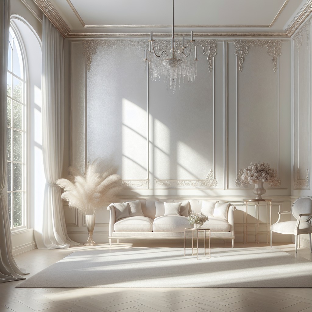
Simply White Undertones and Impact of Natural Lighting
Warm and inviting, Simply White (OC-117) is favored for its creamy undertones that bring a softness to living spaces. Unlike the starkness that some pure whites convey, this shade exudes a touch of warmth due to its yellow undertones, which are particularly delicate and almost imperceptible.
In rooms bathed in an abundance of natural light, Simply White glows, reflecting light in a way that can make the space feel larger and more welcoming. However, in north-facing rooms or areas with limited daylight, the paint may exhibit more of its creamy nature, potentially losing some of its bright, crisp appeal.
For those wanting to maintain the integrity of Simply White’s brightness in lower light conditions, pairing it with contrasting colors can help preserve its luminosity. Conversely, in well-lit spaces, Simply White’s chameleon-like ability to catch and reflect light allows it to act as a versatile backdrop, adaptable to changing daylight from sunrise to sunset.
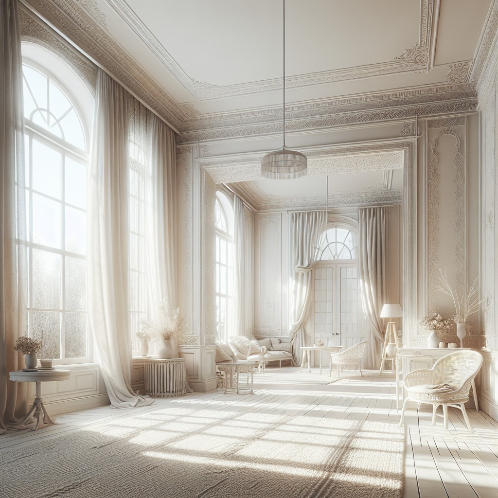
Chantilly Lace Undertones and Impact of Natural Lighting
Chantilly Lace is often celebrated for its true white quality, lacking any significant undertones of other colors. This purity allows it to act like a chameleon, delicately reflecting the surrounding hues and ambient light.
In spaces bathed in abundant natural light, this Benjamin Moore paint takes on a bright, crisp appearance. However, it’s important to note that in northern light, which can be cooler, Chantilly Lace might seem slightly less warm. Conversely, in southern exposure with ample sunlight, it can appear even more radiant without becoming stark.
For those seeking a white that maintains its neutrality without veering into cream or gray territory, this shade can be an excellent candidate. Its minimal undertones make it a reliable choice for art galleries or modern, minimalist spaces where the interplay of shadow and light is celebrated.
Comparison of Warmth and Coolness in Simply White and Chantilly Lace
Both Simply White and Chantilly Lace offer unique takes on white that can subtly influence the mood and aesthetic of a room.
– Simply White, with its slightly warm hue, exudes a soft, welcoming ambiance. Its gentle yellow undertones can bring a cozy warmth to spaces that receive less natural light, making it ideal for creating a snug and inviting atmosphere.
– Chantilly Lace, on the other hand, stands on the cooler side of the spectrum. With minimal undertones and a crisper feel, it reflects light more purely, delivering a clean, sharp look. This paint color shines in well-lit spaces, giving off a bright and airy vibe that can help to open up smaller rooms or highlight modern decor.
The decision between these two whites will often come down to the room’s lighting and the desired emotional impact. For a tender glow, Simply White will do the trick, while Chantilly Lace will provide a more neutral backdrop with a fresh clarity. Remember, the unique elements in your space, such as flooring, furniture, and textiles, will also interact with these paint colors, further affecting their warmth or coolness.
When to Choose Simply White Over Chantilly Lace and Vice Versa
Opting for Simply White often works best when you’re aiming for a warm, inviting ambiance. Its slight yellow undertones bring a cozy glow to spaces with abundant natural light, making it a perfect fit for living rooms or bedrooms where comfort is key.
It’s also a smart pick for rooms with north-facing windows, as it can help offset the cooler daylight.
Conversely, Chantilly Lace is your go-to for a crisp, clean aesthetic that remains true under various lighting conditions. The absence of noticeable undertones keeps it from casting different hues throughout the day, making it ideal for spaces where precise color representation is important, such as art studios or home offices.
Moreover, in south-facing rooms, Chantilly Lace will maintain its pure white appearance without becoming too stark.
Remember the mood you wish to create and the lighting conditions of your room when deciding between the two. Each has its own charm and ability to complement different styles and spaces.
Coordinating Colors With Simply White and Chantilly Lace
Pairing the right colors with Simply White or Chantilly Lace can enhance the aesthetic appeal of your room, as both serve as versatile backdrops for various design styles.
For Simply White, consider complementing it with soft earth tones like sandy beiges or warm grays to highlight its subtle warmth without overpowering the space. Bold, rich colors like navy or emerald also work well, bringing a lively contrast against its creamy background.
Chantilly Lace, on the other hand, pairs beautifully with cool blues and crisp greys, which accentuate its clean and bright nature. If you’re looking to create a more dynamic space, introduce pops of vibrant colors such as coral or turquoise, which will stand out crisply against this pure white.
Be mindful of the room’s purpose and lighting conditions when selecting coordinating colors, as they can affect the perception of both whites. For instance, in a north-facing room, Chantilly Lace might keep its crispness, while Simply White could help in adding a touch of warmth.
Tips On Choosing the Right Sheen
Consider the room’s activity level; high-traffic areas benefit from semi-gloss or satin finishes for durability and ease of cleaning. For spaces with less hustle and bustle, an eggshell or matte finish provides a sophisticated, non-reflective backdrop.
Evaluate the wall’s condition. Imperfections are more forgiving under flatter sheens, while higher gloss levels highlight details. If you’re working with less-than-perfect walls, steer clear of high-gloss options.
Reflect on the desired ambiance. Matte and eggshell finishes offer a soft glow that can make spaces feel cozier, whereas higher gloss levels contribute to a brighter and more invigorating environment.
Account for the lighting nuances. Remember, glossier finishes will reflect more light. Rooms with ample natural light or strong artificial lighting might do well with a less reflective sheen to avoid overwhelming brightness.
Experiment with samples. Paint a small area and observe it at different times of the day. This firsthand experience is invaluable and ensures you make a well-informed decision that will satisfy your vision for the room.
Final Thoughts On Selecting the Ideal White Paint
Moving beyond the specific comparison of Simply White and Chantilly Lace, selecting the perfect white paint for your space can feel daunting, but it needn’t be. Consider these key points:
- Room’s Purpose and Mood: The function of the room and the mood you aim to create are crucial. Crisp, clean whites can invigorate a home office, while warmer whites might better suit cozy living areas.
- Existing Decor and Architecture: Take into account your room’s features, such as flooring and molding. Your white should complement these elements, not clash with them.
- Lighting Conditions: Always test paint swatches in different lighting conditions within your space. The light direction, whether it’s north-facing or south-facing, profoundly affects the paint’s hue throughout the day.
- Pairing with Other Colors: Envision the overall palette of your room. Whites must align with other colors in your decor to avoid discordance.
- Samples Are Your Friends: Invest in sample pots or peel-and-stick swatches. Apply them to different walls and observe over a few days. This step can save you from commitment to the wrong shade.
- Trust Your Instincts: Your perception of color is unique. If a shade feels right and complements your space, it’s likely a good choice.
Remember, the ideal white is the one that feels right in your home and functions harmoniously with your lifestyle and aesthetic preferences.
FAQ
Is simply white too yellow?
No, Simply White OC-117, while having a hint of a yellow undertone, is not considered yellow due to its high light reflectance value of 91, which provides it with a clean, crisp appearance.
What is slightly warmer than chantilly lace?
Pure White is a hue that is slightly warmer than Chantilly Lace.
What is the most popular Benjamin Moore white paint color?
The most popular Benjamin Moore white paint color is White Dove OC-17.
Is chantilly lace the same as pure white?
No, Chantilly Lace is not the same as Pure White; the former has a slight twinge of blue and is brighter, while the latter has muted tones with a slight yellow undertone.
How does natural light affect the appearance of Simply White and Chantilly Lace?
Natural light enhances the neutral undertones of Simply White and makes Chantilly Lace appear brighter and more crisp.
Are there any specific color hues that complement Chantilly Lace?
Chantilly Lace, a pure white paint color, pairs well with color hues such as soft grays, light blues, and subtle greens for a harmonious and sophisticated feel.
Which of these white paint colors would work best in a room with minimal natural light?
Opting for a white paint with warm undertones, like Sherwin-Williams’ Alabaster or Benjamin Moore’s White Dove, can add a subtle hint of color and warmth to a room with minimal natural light.
Read More
 15 Kitchen Garden Ideas for a Fresh and Fun Home Cooking Experience
 Kitchen Table Poly: Understanding Non-Hierarchical Relationships
 What Color Paint Goes with Brown Granite: Matching Tips for Your Home Décor
 Watch Cutthroat Kitchen Online Free: A Basic Guide to Free Streaming Platforms
 8×12 Prints Size: Understanding and Utilizing in Interior Design